// branding

social media
Art Director // Project Manager
strategy created with Leah Redensky // copy written by Jacob Hamblin // photography by Jim Kemper

challenge
ZAGG’s social content has an engagement rate of less than 1% with low reach
goal
increase impressions, grow followers, and have a consistent engagement rate of 3%
research
exploring the landscape
pulling inspo from skullcandy, cotopaxi, and milk bar
discoveries: aesthetic consistency allows for familiarity
ideation
designing a process for campaign creation
identifying target audiences using website and social data
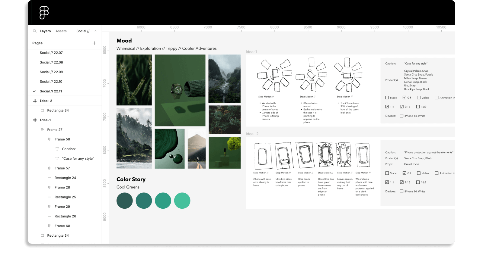
experimenting with monochromatic imagery
iteration
refining the art direction
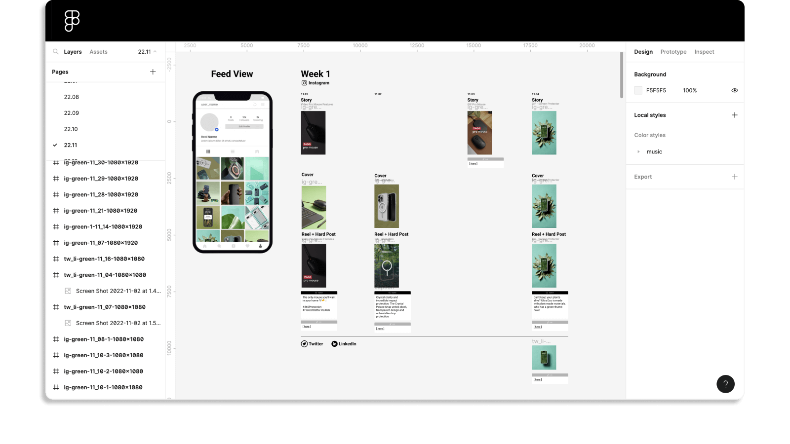
creating figma templates
setting up weekly performance calls
pulling in data to determine our next campaign theme
implementation
applying the new process and data findings to imagery
prioritizing imagery with motion
curating content to our audience

impact
increased average engagement rate to 3.2%
follower increase of 3.6k over 6 months
increased impressions by an average of 24%

ui imagery
Art Director // Project Lead // Designer
design principles created with Erin Snyder // creative direction by Ether Ling

challenge
software screenshots are confusing for our users
goal
show off the software in an approachable and informative way
research
exploring the landscape
pulling inspo from figma, asana, and adobe xd
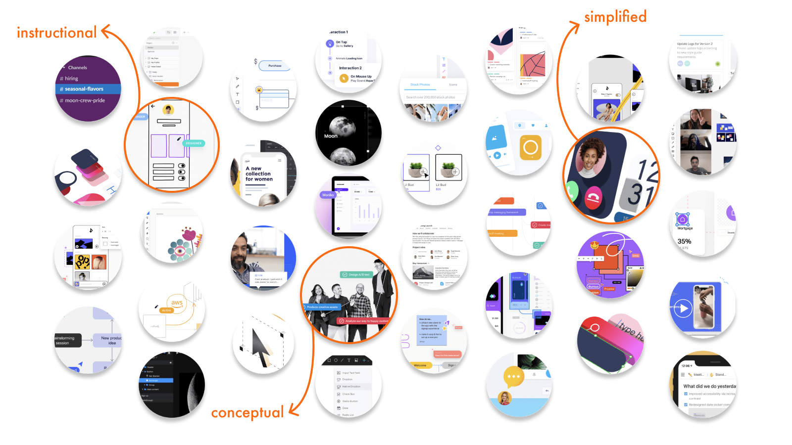
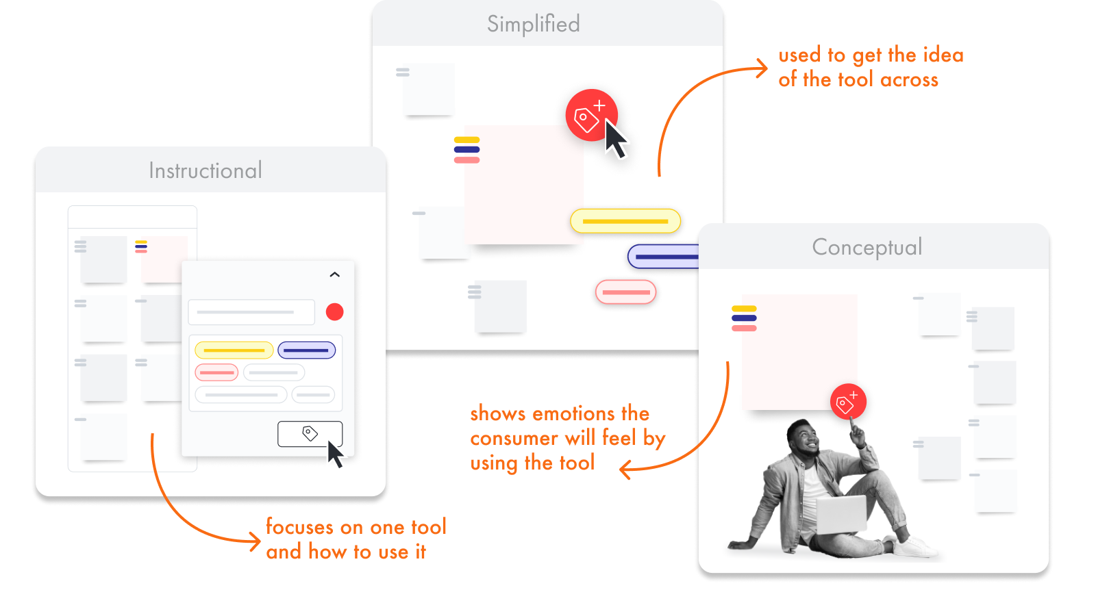
discoveries: each brand has 3 levels of ui fidelity in marketing materials
ideation
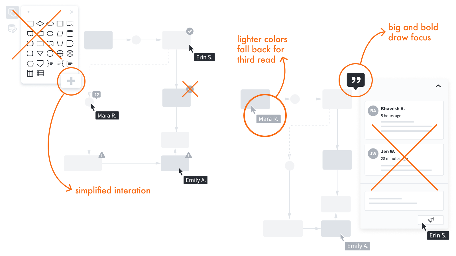
discovering how to create focus in imagery and how we want it to read
deciding what software elements are necessary to explain function
figuring out how much product ui is too much
iteration
refining the art direction
setting up rules and use cases for imagery creation
implementation
educational styling is only used for onboarding and in product
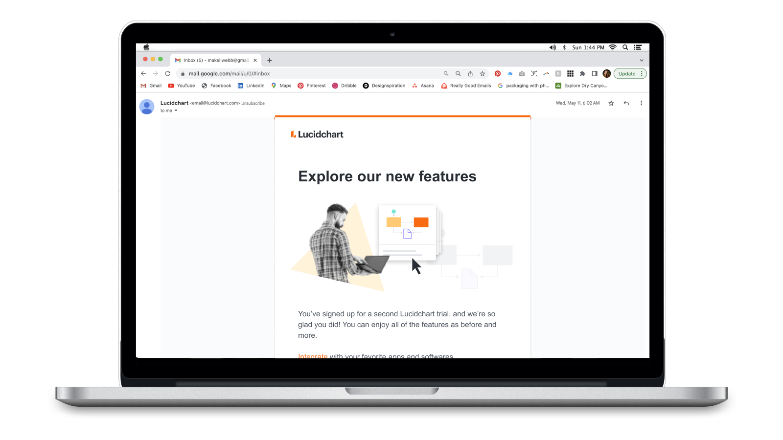
inspirational styling is used for all marketing

impact
created consistency across the suite of products
allowed the product marketing managers to show how products work together

brand creation
Art Director // Project Manager // Designer

challenge
our brand doesn’t reflect our personality
goal
create a friendly brand that reflects its owners
research
sticky note exercise with clients to discover brand personality
creating a mood to align with the discoveries
discoveries: the team is creative, easy going, innovative, and rad
ideation
taking notes from the inspo and personality
exploring logos, colors, and typefaces
iteration
refining the logo through 6 rounds of iteration
solidifying a tagline
finalizing aesthetics with the theme of "retro-modern space man"
implementation
designing a digestible style guide
applying brand elements to swag
creating headshots

impact
polished branding made the company look trustworthy online
atomic city received more organic leads and referrals


